

|
|
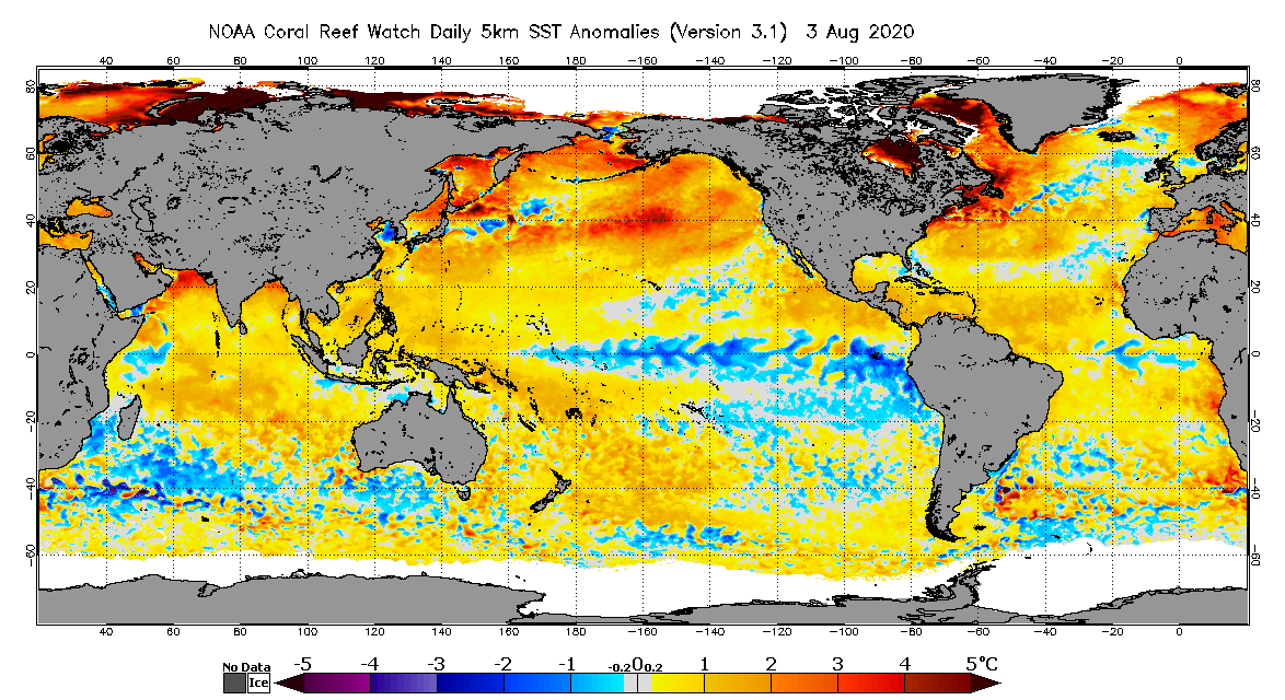
NOAA CRW's daily global 5km satellite Sea Surface Temperature (SST) Anomaly product identifies locations around the world, where the daily SST, observed by the different geostationary and polar-orbiting environmental satellites operated by NOAA and its partners, is different from the normal SST conditions for that day of the year.
To calculate the daily SST Anomaly at every satellite ocean pixel around the world, we first needed to know the long-term mean SST at each location.
As discussed in the previous section, we started with 28 years of satellite data (1985-2012) from the
daily global 5km CoralTemp satellite SST product and calculated the mean (average) SST
for each calendar month for each satellite pixel in the world's oceans. Next,
for each calendar month, we calculated both (a) an initial 28-year monthly mean climatology, and (b) the
linear regression
But wait! Doesn't the daily global 5km satellite SST Anomaly product identify locations
around the world, where the SST is different from the normal temperature conditions for that day? Yes – that is correct! So to calculate a
daily 5km SST Anomaly, you need a daily climatology. We calculate the daily
climatologies from the final 12 monthly mean SST climatologies discussed above, via
linear interpolation An example daily global 5km SST Anomaly product map is shown above, in the top right corner of this section. Areas in dark purple to light blue represent a negative anomaly; that is, the daily SST observed via satellite is cooler than the mean SST for that area. Areas colored in yellow to dark red/brown represent a positive anomaly; that is, the daily SST observed by satellite is warmer than the mean SST for that area. The temperature anomalies range from -5.0 to +5.0 degrees Celsius (°C). Data and images are updated daily and available for free on the CRW website at https://coralreefwatch.noaa.gov/product/5km/index.php. Later in this tutorial, we will cover Time Series Data and Graphs associated with NOAA CRW's 5km Regional Virtual Stations product. Time series graphs show each Regional Virtual Station's daily SST (along with the SST range of the Station's selected satellite pixels), Degree Heating Week, and Bleaching Alert Area heat stress levels since January 1, 1985. It is important to note, however, that the time series graphs also give an indication of whether the SST at that 5km Regional Virtual Station is above or below the mean SST, as you will see in the following example two-year (2019-2020) time series graph for the Main Hawaiian Islands 5km Regional Virtual Station. On this time series graph, the current daily 5km CoralTemp satellite SST is shown as a dark bluish-purple solid line. The Monthly Mean Climatology for the Main Hawaiian Islands is denoted on the graph as light blue crosses. The calendar months are shown along the bottom of the graph. The area on the time series graph that is between the dark bluish-purple solid line (SST) and the light blue crosses (Monthly Mean Climatology) is the daily 5km SST Anomaly. In this example, you can see that the Main Hawaiian Islands 5km Regional Virtual Station experienced positive anomalies throughout 2019-2020, as the daily 5km SSTs were consistently above the Monthly Mean Climatology temperatures for the entire period. 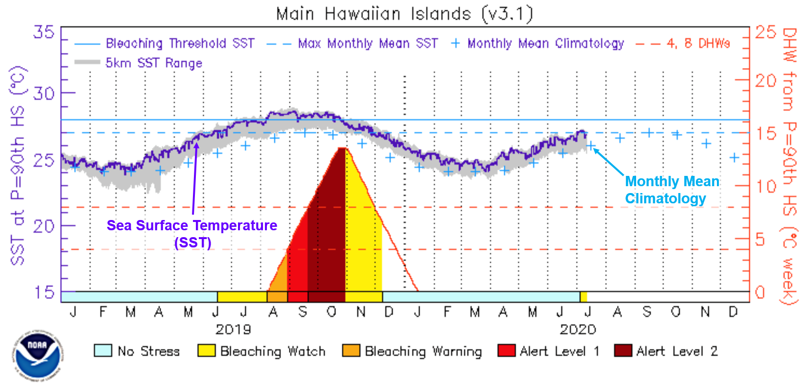
|
||||||||||||||||
|
|
|||||||||||||||||