


|
|
For each of the 50km Virtual Station sites (introduced earlier in this tutorial), we also show how the sea surface temperature (SST) changes over time. For Coral Reef Watch's heritage 50km Virtual Stations (retired in April 2020), the graphs begin in 2000 and span to the product's retirement. Let's look at an example from the 50km Virtual Station at Heron Island, on Australia's Great Barrier Reef:
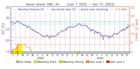
This graph contains two years of 50km satellite SST data (2002-2003), which is shown as a dark blue solid line. The 50km SST was lower during August and September, which is winter in the southern hemisphere, in both years. The highest 50km SST observed remotely during those two years happened in mid-February 2002, when the SST reached approximately 29°C. We will return to this graph later in the tutorial, to talk about the other kinds of 50km data shown on the image. Click here to access the graphs and data for the 50km Virtual Stations.
|
|
|||||||||||
|
|
|||||||||||||