


(Updated June 8, 2020*)
Product Overview:
NOAA Coral Reef Watch (CRW) has developed a set of experimental daily 5km Regional Virtual Stations (219 total, with 5 duplicated Stations in overlapping regions, as of December 2023). The Regional Virtual Stations represent a change in the way we have looked at Virtual Station data in the past. They have been designed to take advantage of higher resolution data while simultaneously providing comprehensive and collective information on all reefs in a jurisdiction or predetermined sub-region. We realized early on that data from a single 5km pixel (satellite data grid point) provide much higher spatial detail but are less representative of a region's thermal conditions. Also, many coral reef ecosystem managers wanted to know what was happening across their entire jurisdiction. Rather than constructing Virtual Stations based on single 5km pixels as we did in our heritage twice-weekly global 50km Virtual Stations (retired April 30, 2020), we created Regional Virtual Stations based on data from all of the 5km grids within each individual jurisdiction/region/sub-region (e.g., Main Hawaiian Islands). An alert for a region is meant to inform users that they should look at the map products for more detail. We offer a number of products as part of the Regional Virtual Stations, including:
- Regional Bleaching Heat Stress Gauges
- Two-year time series graphs
- Multi-year time series graphs
- Virtual Stations map with data overlays in a Google Maps interface
- Virtual Stations map with data overlays in a Google Earth file
- Satellite Bleaching Alert Email System (free, automated, subscription-based; one alert per region; sent out up to two times per week for Stations that experienced heat stress level changes)
Design of Daily 5km Regional Virtual Stations:
NOAA CRW designed the Regional Virtual Stations using a 5km global coral reef mask that was developed using available references. These included the Millennium Coral Reef project maps, the International Union for Conservation of Nature's (IUCN) Coral Reefs of the World (Vol. 1, 2, and 3), the United Nations Environment Programme-World Conservation Monitoring Centre (UNEP-WCMC) World Atlas of Coral Reefs, several country scale atlas publications, and a few other resources. The reef mask is updated as new information on coral reef locations is added periodically. Reef locations were separated into 219 individual Stations (5 of which are duplicated in overlapping regions) covering most of the global coral reef regions and following country boundaries and island nation groups where possible. Reef pixels within each jurisdiction were given a 20km buffer indicating the boundary of the individual Regional Virtual Station. The size of these regions varies greatly, but the methodology for calculating alerts within each region is held consistent.
Calculating Bleaching Alert Levels:
CRW's developement of its daily global 5km satellite-based coral bleaching heat stress product suite has led to changes in the way we calculate Regional Virtual Station alerts. A time series of data is generated for each Regional Virtual Station based on data that fall within the boundary of a region/jurisdiction/sub-region. Rather than provide every value of every data point within the boundary of the station, we derive the Degree Heating Week (DHW) value and Bleaching Alert Area heat stress level (Bleaching Alert Level) based on the 90th percentile Coral Bleaching HotSpot value. This allows for each station's data to be internally consistent and keeps a few stray warm pixels from falsely exaggerating the alert levels. These values, as well as sea surface temperature (SST) ranges, and climatology information are stored in an ASCII text file and accessed by the Bleaching Heat Stress Gauge pages and Satellite Bleaching Alert email system.
ASCII Data File Description:
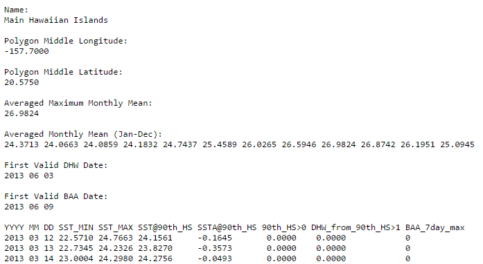
The time series data file for the Regional Virtual Stations is in ASCII text format. A sample file for the Main Hawaiian Islands can be accessed by clicking the image above. Time series data are updated daily, concurrently with CRW's daily global 5km products. These data are used to create the time series graphs found on the Regional Virtual Station pages. The first 22 rows of each file is the header containing the name of the region, the polygon middle latitude and longitude representing the icons on the Google Maps and Google Earth interfaces, the first valid DHW and Bleaching Alert Area dates, and the region-specific climatological data described below:
Averaged Maximum Monthly Mean (MMM):
The maximum value across the twelve average monthly mean daily global 5km 'CoralTemp' SSTs for pixels contained in a Regional Virtual Station.
This value is represented as a dashed light blue line on the time series graphs.
The bleaching threshold (solid light blue line) is 1 degree Celsius greater than this MMM value.
Averaged Monthly Mean (Jan-Dec):
The average of the monthly mean daily global 5km 'CoralTemp' SSTs for pixels contained in a Regional Virtual Station.
These values are represented as light blue "+" symbols on the time series graphs. The maximum of these values represents the MMM for a particular Regional Virtual Station.
First Valid DHW and BAA date:
The Degree Heating Week (DHW) product for Regional Virtual Stations is an accumulation of the 90th percentile Coral Bleaching HotSpot values within each station.
Because it is an accumulation over a 12-week period, there cannot be a DHW value until 12 weeks of HotSpots have occurred.
Therefore the first valid DHW date is later than the first valid SST and HotSpot date. The same goes for the Bleaching Alert Area product,
which has a slightly later start date, due to the fact that it is a 7-day maximum composite.
The last line of the header describes the time series data that follows. There are 10 fields in each record described in detail below:
YYYY, MM, DD:
These are the year, month, and day, respectively, of the data.
SST_MIN and SST_MAX:
The minimum and maximum daily global 5km 'CoralTemp' SST value for pixels contained in a Regional Virtual Station.
This shows the dynamic range in SST values within a Regional Virtual Station and is a reference
for the size and variability of oceanographic conditions of a station.
SST@90th_HS:
The daily SST value where the Coral Bleaching HotSpot value is equal to the 90th percentile HotSpot value for
pixels contained in a Regional Virtual Station. This acts as a moving pixel within a region
that is free to migrate with each data update. It follows thermal stress as indicated by the
HotSpot value for that day. These values are represented on the time series graphs as a solid
dark blue line that falls within the SST_MIN and SST_MAX range. This value is used in the information balloons in the
Google Maps
and Google Earth interfaces.
SSTA@90th_HS:
The daily global 5km SST Anomaly value where the Coral Bleaching HotSpot value is equal to the 90th percentile HotSpot value for
pixels contained in a Regional Virtual Station. This acts as a moving pixel within a region
that is free to migrate with each data update. It follows temperature anomalies as indicated by the Coral Bleaching
HotSpot value for that day. This value is used in the information balloons in the
Google Maps
and Google Earth interfaces.
90th_HS>0:
The daily 90th percentile Coral Bleaching HotSpot value (positive only) for pixels contained in a Regional Virtual Station. This acts as a moving pixel within a region
that is free to migrate with each data update. This value is used in the information balloons in the Google Maps
and Google Earth interfaces. This value
is accumulated over time to calculate the Degree Heating Week and Bleaching Alert Area values for each Regional Virtual
Station.
DHW_from_90th_HS>1:
The daily global 5km DHW value calculated by accumulating daily 90th percentile Coral Bleaching HotSpot values (greater than 1)
for pixels contained in a Regional Virtual Station. This value is used in the information balloons in the
Google Maps
and Google Earth interfaces. This value is represented as
a solid red line on the time series graphs.
BAA_7day_max:
The daily global 5km Bleaching Alert Area single-day value is derived from the 90th percentile Coral Bleaching HotSpot and DHW pair.
This follows CRW's existing algorithm, but uses the unique 90th percentile Coral Bleaching HotSpot and DHW values
for each Regional Virtual Station. From the Bleaching Alert Area single-day values, the rolling Bleaching Alert Area (7-day maximum) composite value
is calculated and used to color the area below the DHW trace on the time series graph. These alert values are used to change the Bleaching Heat Stress Gauges and send automated alerts
to Satellite Bleaching Alert Email System subscribers. A value of 0 = No Stress, 1 = Bleaching Watch, 2 = Bleaching Warning, 3 = Alert Level 1, and
4 = Alert Level 2.
Regional Virtual Station Time Series Graph Description
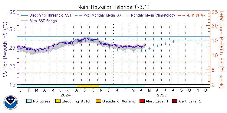
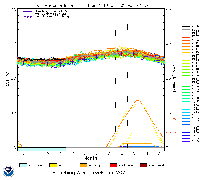
The Regional Virtual Station time series graphs display the values from the ASCII text files described above, from January 1, 1985 to the present. Currently, two types of graphs are available: two-year graphs (click on the sample graph above) and multi-year graphs. Both graphs were created from the same data accessible from CRW's Regional Virtual Stations data page. The multi-year graphs provide a convenient way to compare the changes in daily global 5km 'CoralTemp' SST and DHW through the annual cycle, among years, while recent SST and DHW variations can be examined easily on the two-year graphs. These graphs and corresponding data (accessible from the Regional Virtual Stations web pages) depict the historical record of regionally representative daily global 5km 'CoralTemp' SST and coral bleaching heat stress measurements at each Regional Virtual Station.
The representative SST value is shown in the center of the graphs and read using the vertical axis on the left. The DHW is shown in the bottom portion of the graphs and read using the vertical axis on the right. In the multi-year graphs, the SST and DHW time series for the current year are drawn in thick black solid lines; the past year is drawn as a thin gray line. All other years are drawn on a spectrum of colors from blue to red, where red is more recent and blue toward the start of the data.
In both the two-year and multi-year graphs, the coral bleaching heat stress level (or Bleaching Alert Level) is color-coded and drawn along the bottom horizontal axis. On the multi-year graphs, the bleaching alert level is drawn for the current year only. In the two-year graphs, the area under the red DHW trace is also colored by the Bleaching Alert Level. Bleaching heat stress is categorized into five bleaching risk levels (defined below) based on the summary of the Coral Bleaching HotSpot and Degree Heating Week values experienced at the Regional Virtual Stations.
|
Stress Level No Stress Bleaching Watch Bleaching Warning Bleaching Alert Level 1 Bleaching Alert Level 2 |
Definition HotSpot <= 0 0 < HotSpot < 1 1 <= HotSpot and 0 < DHW < 4 1 <= HotSpot and 4 <= DHW < 8 1 <= HotSpot and 8 <= DHW |
As in CRW's Bleaching Alert Area product, at Bleaching Alert Level 1, significant bleaching is expected within a few weeks of the alert. At Bleaching Alert Level 2 and above, severe, widespread bleaching and significant coral mortality are likely. Red dashed lines across the graphs indicate DHW threshold values of 4- and 8-degree Celsius-weeks (triggers for Bleaching Alert Levels 1 and 2, respectively). The color of the alert level represents the maximum level of the last 7 days.
Three types of information describing the long-term mean conditions for a Regional Virtual Station site are also provided on each graph: the monthly mean climatology, the MMM, and the bleaching threshold SST. Monthly mean SST climatologies (blue crosses) are also drawn to show "normal" SST conditions at each Regional Virtual Station; the peak of the bleaching season typically falls during, or immediately following, the warmest months of the climatology. Note: the time of peak bleaching varies among ocean basins and hemispheres. Generally, for the northern Atlantic and Pacific Oceans, it is July-September; for the southern Atlantic and Pacific Oceans, January-March. The peak season for the northern Indian Ocean is April-June and for the southern Indian Ocean, January-April.
The newly calculated MMM SST climatology (Averaged Maximum Monthly Mean in the data file) is featured as a dashed light-blue line on the graphs. It is the warmest of the twelve monthly mean SST climatology values (Averaged Monthly Mean in the data file). The Coral Bleaching Threshold SST (solid light-blue line) is defined as the MMM SST plus one degree Celsius. The climatology, MMM SST, and Coral Bleaching Threshold SST are region-specific in the 5km products.
Note that all Daily 5km Regional Virtual Stations also can be accessed using Google Earth.
*Updates to Daily 5km Regional Virtual Stations product
August 31, 2023
- Adjusted multi-year graph scaling and moved legend to the right side of the graph.
June 8, 2020
- Updated links and revised text in the product description.
- Added a note about the retirement of the heritage twice-weekly global 50km products on April 30, 2020.
July 31, 2019
- Release of Version 3.1 5km product suite.
- Regional Virtual Station maps and data extended back to January 1, 1985.
- Updated Outlook maps to version 5.
May 08, 2017
- Release of Version 3 5km product suite.
- Change header of time series data file.
- Change DHW and BAA calculation method.
- Updated description page with new methodology.
- Added 5km SST range to 2-year time series graphs.
- Updated 2-year time series graph axes titles.
May 19, 2015
- Changed name of "Averaged Maximum Monthly Mean" to "Maximum Monthly Mean".
- Updated description of Maximum Monthly Mean to better represent the definition.
- Changed name of "Averaged Monthly Mean (Jan-Dec)" to "Monthly Mean (Jan-Dec)".
Mar 27, 2015
- Changed representative climatological value from 90th percentile to the average.
- Use 90th percentile DHW value in time series graphs.
- Use the maximum 10% of the 7-day maximum running bleaching alert area product on
the time series figures.
- Changed ASCII text file headers and removed old columns HS_TS and DHW_TS.
"MMM_TS" is now "Averaged Maximum Monthly Mean"
"MONTHLY_TS (JAN-DEC)" is now "Averaged Monthly Mean (Jan-Dec)""
"SST_TS" is now "SST_AT_HS_90TH"
"SST_10", ... "DHW_10" are now "SST_90TH", ... "DHW_90TH"
"BAA_10" is now "BAA_MAX_10"
- Changed bleaching alert color scale on 2-year and multi-year time series graphs.
- Changed past year color scheme for multi-year time series graphs.
Feb 17, 2015
- Initial release.

